MATERIAL EMPATHY
Human, setting and the communication of the relationship between.
The project is about how colours and materiality can create a sense of wellbeing. In search of what makes a joyful space, I have reached to a conclusion, that it is the levels and nuances between bright and pale, glossy and absorbing that offer experience in modern atmospheres. It is a dream and a fantasy of softness, dwelling and empathy. My method of work derives from analysis of spaces, interruption, human-reaction, interpretation and representation. I aim to evoke the discussion of how design could be seen as an actual correspondence before the final form-giving to an object as well as comment on the current functional aspects of designing a space for wellbeing.


1. FRAME
Essentially, my interest is the communication between us humans, our surrounding settings and materiality. That being said, I would like to emphasise that the main focus in my process has been on the method how material affects us and the process of thinking and process of designing not on product development per se. It is my own methodological way of thinking about design that is fuelled by conversations about spatial characteristics and empathic & relational aspects of design.
METHOD / TERMINOLOGY
I have mostly worked with a term and method “material empathy”. I have used it throughout the process with analysing the subjects in my field work. From the start of setting the framework of the project until the end of understanding materials myself (empathically), I think it is important to emphasise- materials can make us feel at comfort, we all have a relationship with them- weather its stone, wood, plastic, foam, metal or textile- we have met them. We have touched them. We have a feeling about them.
Material empathy as a method of design derives from the principles of relational aesthetics and empathic design. It is an abstract endeavour of perceiving and signifying the encounter through the materiality connecting us.
In public space we touch little. As a matter of fact, we refrain from touch. Bare thought of bacterias on the door handles, seat covers and table surfaces, make our eyes seek for disinfection. What I work with is the opposite of clinical thinking- it is uplifting colour, materials and surfaces that are a result and collaborative design process between me and the people who I have talked to.
2. PROCESS
I try to explain a little about the whole context and different layers and meta-levels underneath it.
I set the problem formulation: how to work with colour and materiality in holistic context of well-being because I am interested how to seek for contact, how to ask and how does it make people to feel.
The case studies are divided in 3: 1) analysis of spaces where my main interest was what is special or what is missing in these sites, 2) workshop- a small study about materiality and developing colour concepts to be tried on the public and 3) the communication which involved 4 people in both of the locations.
From the case studies I derived to the final concept of material empathy.
3.0 CASE STUDIES
My research was based on what is missing in the locations of well-being institutions and the discussions between strangers of what makes them happiest of my proposed concepts.
3.1 Analysis: hospital waiting rooms
I chose the sites of hospital because it is an environment that facilitates various, contrast emotions and feelings. For knowing more what is the atmosphere and how to investigate it, I conducted a small study where I registered how people move and what is the overall materiality of these sites. I was interested in what is special in these rooms and how much does the context affect how we perceive the setting.
The conclusion from the registrering the sites, was that they are too sterile, cold and lack the sensory elements.
3.2 WORKSHOP: material & colour
Workshop: material & colour
In my project, I address colour and light mostly in the aspects of the character of the intended function- to offer positive sensation.
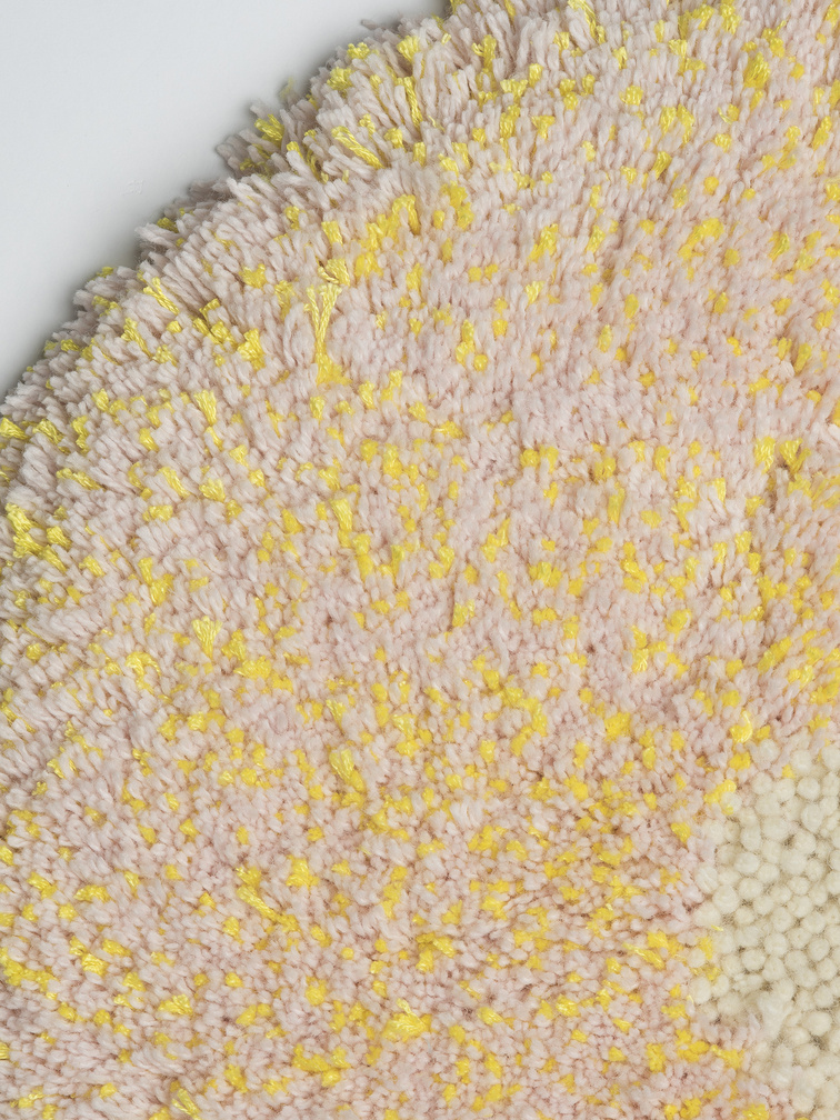
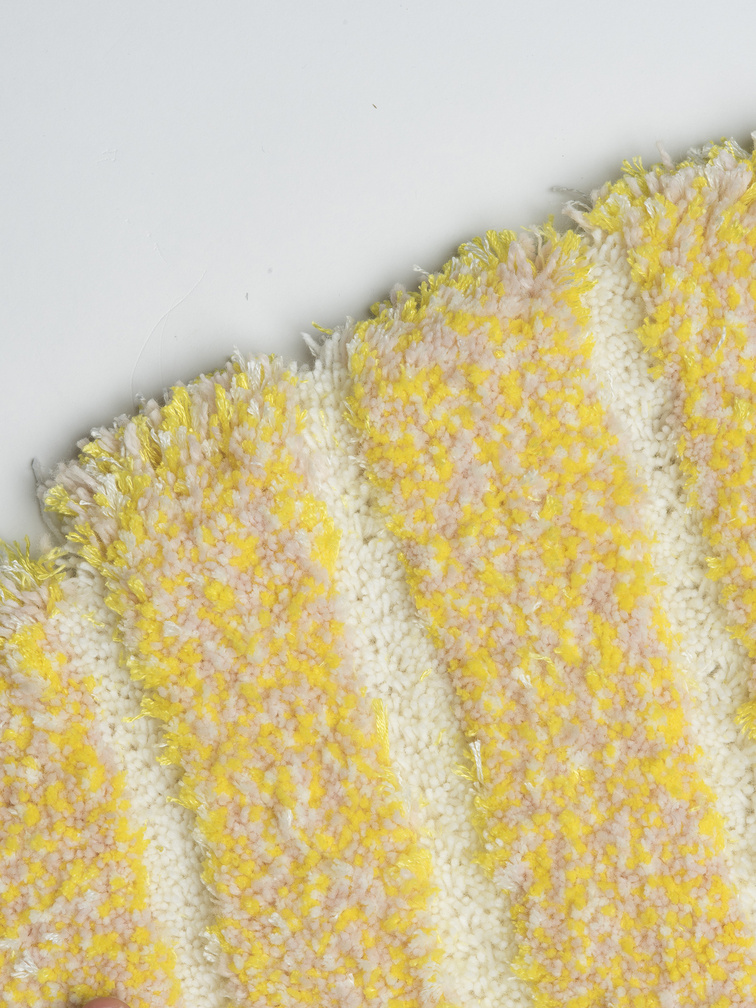
In the colour study I painted firstly 3 different tones of each primary colour: yellow, red, green and blue. From the initial colour study I organised them together as a set of 4- lightest No.1, middle tones No.2 and most contrast No.3
It is interesting how contrast and material changes the perception of colour. This is why decided to show them to people to ask if people consider more positive the shocking colours or more the lighter tones. How your eyes sense the material and how important is to put light into colour?
Discussion into the materiality? What is good to be in?
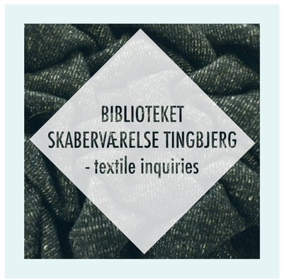
3.3 COMMUNICATION
Analysis: people
As Bourriaud writes: “Artistic activity, for its part, strives to achieve modest connections, open up (one or two) obstructed passages, and connect levels of reality kept apart from one another.” 2 In my recent experience, I searched for connections and the bonds between realities that otherwise would not overlap. To talk about colour that runs across a silky surface with people who have way more existential issues in their minds is maybe not the first relationship one might find when seeking for a discussion. Nevertheless this is the kind of interaction I want the modern world to be- to seek for intrigue and inspiration. It is like adding another room in the house (asking people= to gain perspective of the house.
FEELING
I am looking for the answer of knowing through touch, seeing and feeling.
- What do you feel is missing in these particular spaces?
- How to make a question-answer investigation about feelings of colours and materials with people who pass by these particular locations?
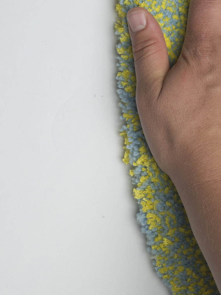
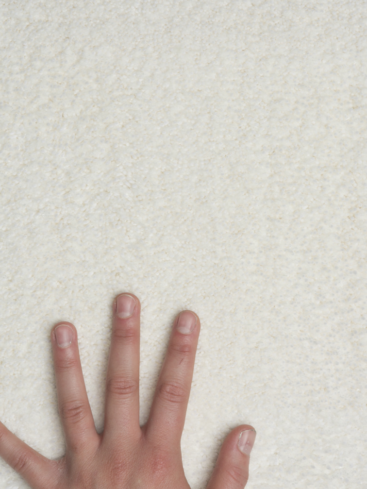
TOUCHING is an important way of knowing.
Positive is lighter and brighter.
Reflection on the communication of materiality: I gained some kind of comparison of realities that usually do not overlap and of how I personally position myself in the field of how people perceive these matters.
4. Experimental laboratory
The method is implemented in the experiment. My design principles for the project are to:
1. Design human size
2. Design uplifting atmosphere
2.1 consists of design colour- lightness and brightness
2.2 design shape- simple and clear
2.3 design composure- the movement in different scales
2.4 design surface
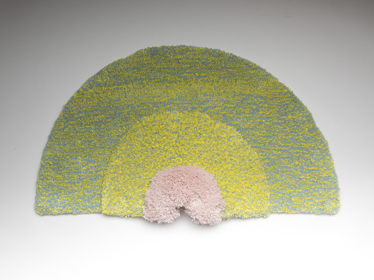
3. 1 element not consisting more than 3 colours (2 main + 1 additional)
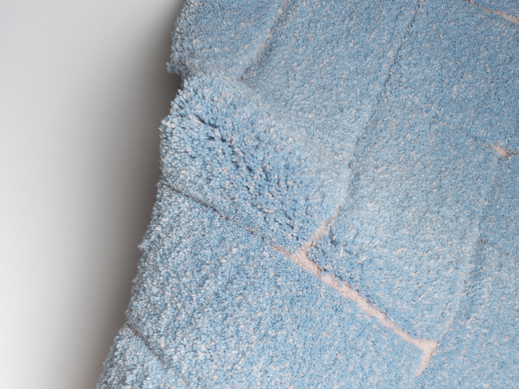
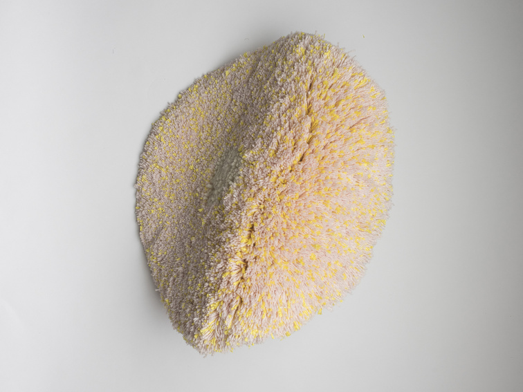
5: Outcome
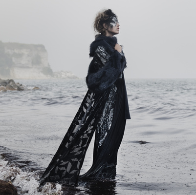
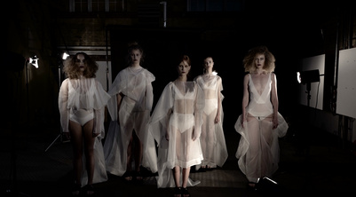
My final work emanates from constellations of persons, objects and surfaces.
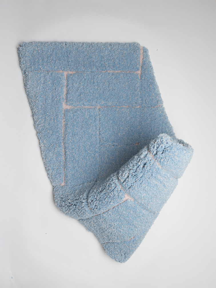
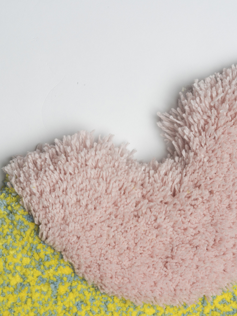
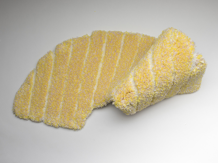
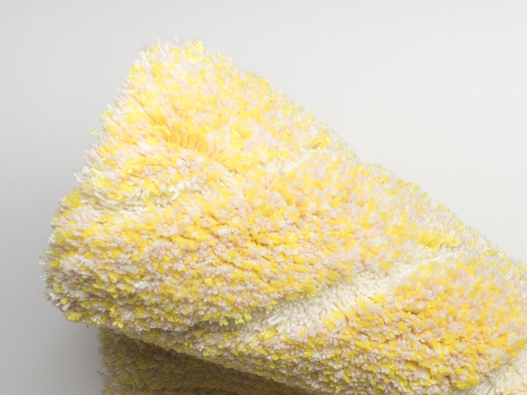
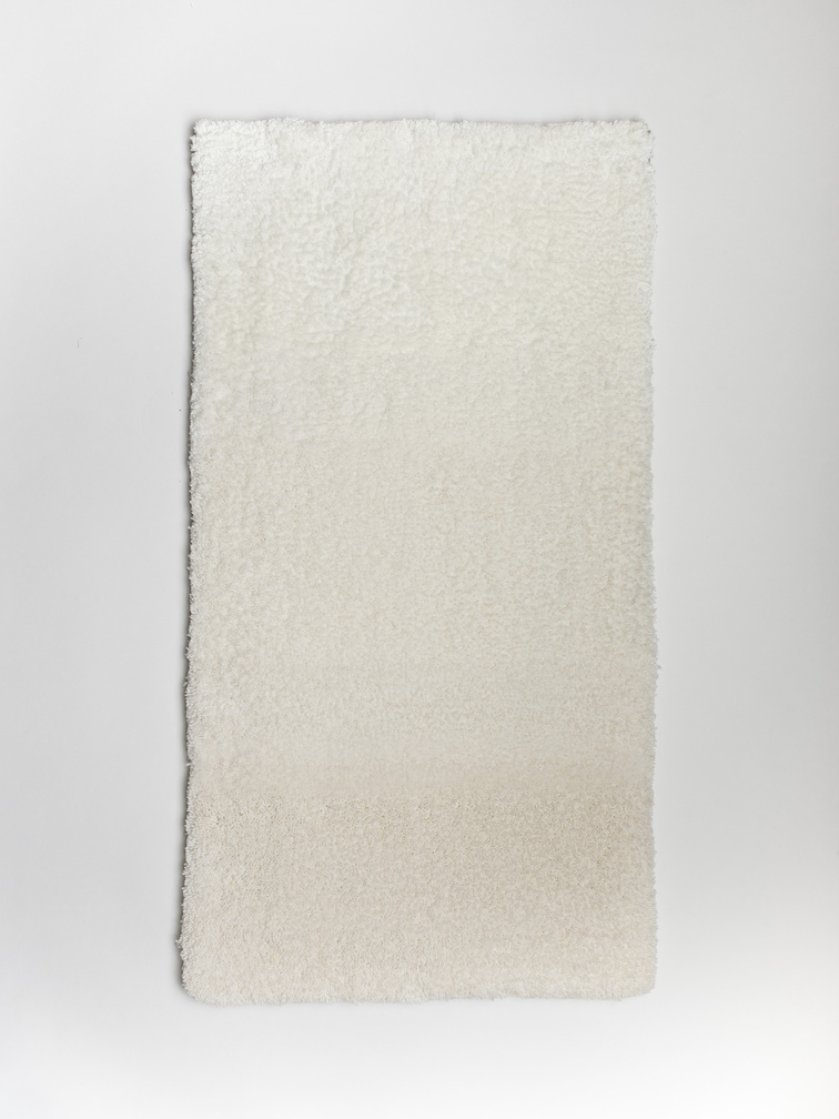
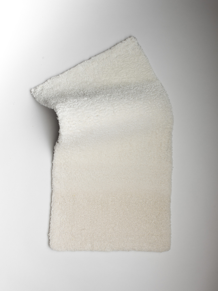
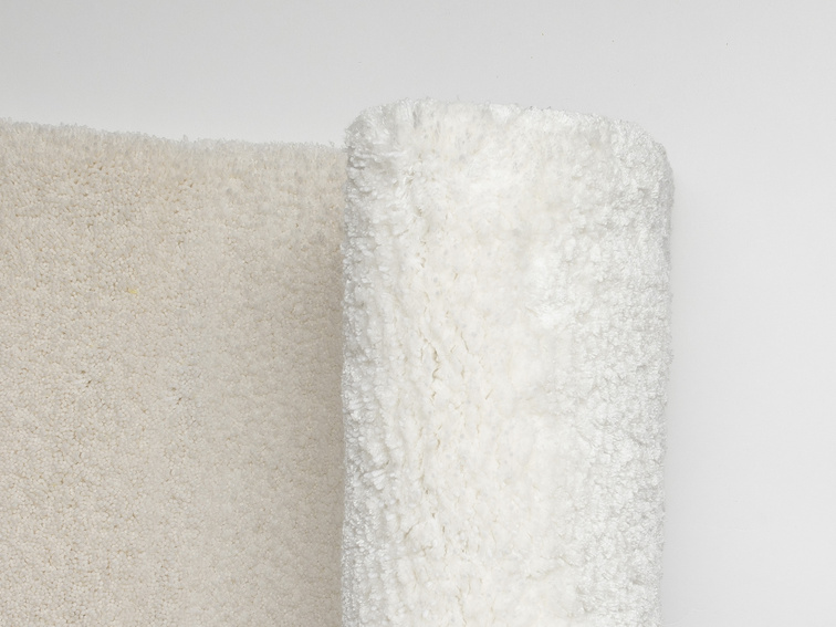
The result of the project is communicational textiles that evoke (hopefully) good sensations.
With this approach I have developed a series of experiences that I believe are in coherence with the method (from a small scale material board to a more focused but analog way of presentation)
I believe that touching as an act in itself can make a huge difference and this is why each of the textiles has a small pictogram to describe the way I see them to be touched or what is the main idea behind it.
Intrinsically I am bond to understanding human-being. I absorb the world in myself and I want to make the world to feel something. It is not a question of liking or not liking, it is a question of material empathy.
There are three things that interest me the most. They are:
1) the touchpoint between object, objectification and the subject.
2) the shift of light within a material
and
3) the communication of these two. I see the communication as a path and this reflects in my textiles by the way your hand moves on them. It is a journey of levels that we need to understand in order to be emphatic towards each other.
I find my method unordinary and marginal besides the traditional design practices. It removes the main attention from the end result to the process and search of the meaning in design.
Kristel Laurits
21 June 2016 in Copenhagen